Movvo - a social app

My Services:

Research,UX/UI design

Year:

2026

A platform for real-world moments and human connection.

At a glance

Running often starts with motivation, but it’s hard to sustain when it feels solitary. Without shared moments, encouragement, or a sense of belonging, even committed runners slowly lose momentum.

70% of users who join run clubs drop off within the first two weeks

What problem does this solve ?

Social media platforms today prioritize visibility and metrics over genuine interaction. Users feel pressured to curate their lives, leading to inauthentic sharing and emotional fatigue.

This product solves the lack of genuine, low-pressure social interaction by shifting focus from metrics to meaningful connection.

Who is this for?

People who want to share moments from their lives without the pressure of constant posting, validation, or algorithm-driven visibility.

MOVVO is ideal for users seeking real-life connection instead of digital competitiveness.

It’s for anyone wishing to share and connect without feeling performed or measured.

Why this approach ?

After talking with bunch of users i came to the conclusion that user drop-off wasn’t a UX problem, it was a relevance problem.

What was the observation ?

Research showed that users weren’t dropping off due to usability issues, but because running felt socially uncomfortable and unfamiliar.

What changed the direction ?

the underlying issue was cultural and emotional. In India, running is rarely a social default. Safety concerns, unfamiliarity with groups, and discomfort joining strangers make traditional running-club models feel intimidating rather than motivating.

And what need to be done.

instead of asking users to commit to running first, the experience needed to help them feel comfortable, connected, and familiar before any physical activity began. Social connection had to come before fitness.

Reserch insights

Potential drop-off scenarios

While there were several reasons behind user drop-offs, These were the most recurring and impactful factors influencing early disengagement:

  • Not knowing anyone in the group, leading to safety concerns and lack of familiarity

  • Interactions feeling surface-level or not meaningful

  • A mismatch in social vibe or group energy

  • Scheduling conflicts due to work or daily routines

The design aim to create a space where people feel supported, motivated, and part of something, making consistency feel natural rather than forced.

Connection focus

People first

Context centric

Moments matter

people who complain
about the UI/UX of the app

people who has social barriers to
join the club

Safety concerns were the dominant factor, with 65% of users in India highlighting it as a key reason for not joining or participating in runs.

Design Goal

The goal was to shape clear entry points, reduce early drop-off, and create momentum through familiarity rather than motivation.

Design an experience that lowers hesitation and builds trust gradually, allowing users to move from curiosity to participation without pressure.

Key Features

• Personalized Home Screen
• Curated Event Recommendations
• Content designed to feel personal, not performative
• Simple, calm UI that encourages presence, not scrolling

Features are intentionally simple to foster authentic, low-pressure interaction.

Design Exploration

Visual direction focused on warmth, movement, and daily life. Imagery highlights candid moments and real environments, with layouts offering breathing space and emotional nuance.

Soft visuals

Natural chat

Gentle alerts

Summing it up

Not all problem can be solved by improving experience. When a product feels meaningful, users are willing to tolerate minor friction, but that meaning comes from deeply understanding their context, not just addressing the usual pain points. In the long run, the products that succeed are those that balance value with meaningful experiences.

Overview

MOVVO is a V1 product being developed by a company currently operating in stealth. Since the product has not yet been publicly launched, I worked closely with the available business and user context to understand the opportunity and shape its first digital experience.

As part of my Product Design diploma, I took the project from initial research and problem discovery through product definition, user flows, and interface design.

MOVVO is a V1 product being developed by a company currently operating in stealth.


Since the product has not yet been publicly launched, I worked closely with the available business and user context to understand the opportunity and shape its first digital experience.


As part of my Product Design diploma, I took the project from initial research and problem discovery through product definition, user flows, and interface design.

Role: Product Designer

Time: 3 weeks

Goal: Build the first version of MOVVO

Problem statement

People aren't necessarily hesitant to join fitness and running clubs because of the quality of the product experience. In India, the bigger barrier is the uncertainty that comes with meeting unfamiliar people in real life. Safety concerns, lack of trust, and anxiety about who they might meet can make people hesitate before joining a club or attending an event.

The challenge

The challenge was to create an experience that reduces this uncertainty and builds enough trust for people to feel comfortable taking the first step toward joining a community.

Interviews

I conducted qualitative interviews with runners to understand their motivations, frustrations, and real behaviors around joining group runs. The conversations revealed emotional barriers like awkwardness and pace anxiety, and practical issues such as inconsistent timings and unclear information. These insights shaped the core needs and direction of the design

The conversations revealed emotional barriers like awkwardness and pace anxiety, and practical issues such as inconsistent timings and unclear information.

FINDING 1

Most users tried group runs once or a few times, but struggled to stay consistent and eventually dropped off.

FINDING 2

Many users hesitate to join group runs because they don’t know anyone, making the experience feel intimidating or uncomfortable.

FINDING 3

Students and working professionals struggle to stay consistent because group run timings rarely match their daily routine.

Reserch insights

Potential drop-off scenarios

Job To Be Done

When users try to join a group or a run, they want the experience to feel welcoming, transparent, and aligned with their pace and schedule, so they can participate confidently and stay consistent without feeling awkward, overwhelmed, or out of place.

challenge 1

Help users discover the right people and groups.

challenge 2

Help them feel part of a club, not just an activity.

challenge 3

Help Them to Stay consistent with support.

Design Goal

The goal was to shape clear entry points, reduce early drop-off, and create momentum through familiarity rather than motivation.

Design an experience that lowers hesitation and builds trust gradually, allowing users to move from curiosity to participation without pressure.

From insights to experience

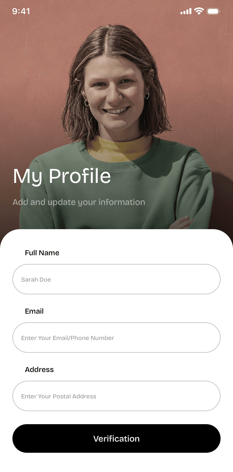
With these insights in mind, I translated the key user needs around safety, trust, and belonging into the product experience. The following screens show how those principles shaped the core flows, from onboarding and discovery to joining clubs and engaging with the community.

Onboarding flow

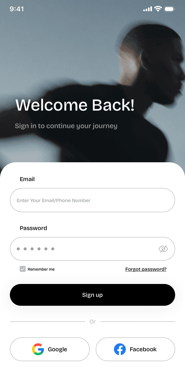
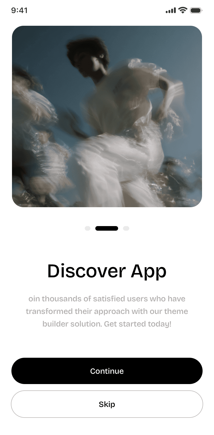
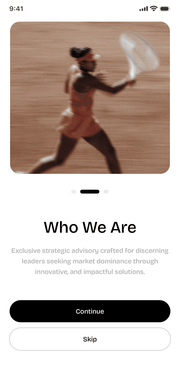
I used onboarding to reduce the uncertainty of joining a new community by introducing the product, setting expectations, and showing users what they could discover before asking them to commit.

Club details & host chat

Helping the users to reduce the uncertainty of joining a new club by giving users enough context about the group, host, and activity before they commit.

Core navigation

designed the core navigation around the moments that matter most: discovering relevant activities, finding communities, staying connected, and managing personal activity. The structure keeps these paths easy to access without overwhelming users with too many choices.

Club discovery & filtering

I designed the discovery flow to help users find communities that feel relevant to them, while giving them enough control to narrow down their options before deciding to join.

feedback and empty state

I designed feedback and empty states to keep users informed, give them a voice, and provide a clear next step when things don’t go as expected.

Closing Note

FINDING 1

People rarely know what they want. They only know what makes sense in the moment they’re living in. The context around them does most of the decision making, not the Wishlist they claim to have.

FINDING 2

Going deeper into why people act a certain way changed the direction more than adding new tools ever would.

FINDING 3

Understanding user context is messy and easy to get wrong, but it’s worth it. It’s the only way to move from a good design to a meaningful one.

Create a free website with Framer, the website builder loved by startups, designers and agencies.